Dunning & Everard
Elevating Interior Design with an Elegant, Magazine-Style Website
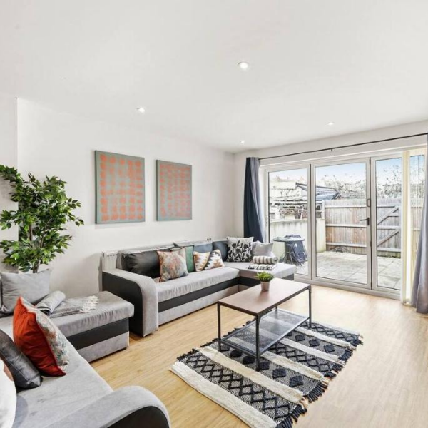
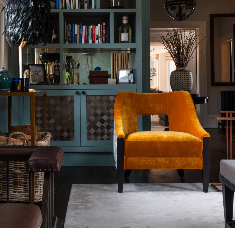
In the world of interior design, a website is more than just a digital presence—it’s a showcase of creativity and style. When Dunning and Everard, a distinguished interior design firm, approached us, they wanted a platform that would truly reflect their sophisticated design aesthetic. Their vision was to have a website that featured their stunning imagery with minimal distractions, allowing their work to take center stage. We collaborated closely with them to craft an elegant, white magazine-style website that meets their needs perfectly.
The Challenge: Highlighting Design with Minimal Distraction
Dunning and Everard’s previous website did not effectively capture the elegance and refinement of their interior design projects. They needed a new site that would not only present their beautiful imagery in a compelling way but also create an immersive experience for visitors. The challenge was to design a site that allowed their portfolio to shine while maintaining a clean, distraction-free environment that emphasized their work.
We designed a bespoke magazine-style website for Dunning and Everard, with a focus on elegance and simplicity. The site features a white, minimalist design that creates a sophisticated backdrop for their high-quality images. By adopting a magazine-style layout, we ensured that each project is presented in a way that highlights its unique beauty without unnecessary distractions. The clean design allows for easy navigation and a visually appealing display of their work, enhancing the overall user experience.
The Results
The new website has been received with great enthusiasm. Dunning and Everard’s portfolio is now showcased in an elegant and visually striking format that aligns with their brand’s high standards. The magazine-style layout provides a seamless experience for visitors, allowing them to explore the firm’s projects and gain a true sense of their design capabilities. The minimal distractions and refined aesthetic effectively communicate the sophistication of their work, reinforcing their position as leaders in the interior design industry.
This project highlights how a well-designed website can elevate a business’s brand and showcase its strengths. For Dunning and Everard, the new magazine-style website serves as a powerful tool for presenting their interior design projects in the most flattering light. We’re proud to have created a platform that not only meets their aesthetic vision but also enhances their ability to connect with potential clients and showcase their design excellence.

 01458 258545